One Crisis Deep
Epistemic status: The numbers are real, and everything can be rerun from the code behind Regime Radar. The interpretation rests on twelve IHSG downtrends and ten in the S&P 500, which is not a lot, and I try to say so every time it matters. Section VII is a hypothesis, not a finding.
I.
On Monday 8 June 2026, IHSG closed at 5,342.14. It was down 4.52% on the day, its fourth straight loss, almost 13% lower than a week earlier and more than 40% below its January high. On Tuesday it bounced 7.6%, and that was the day my own dashboard decided the market was in a downtrend.
The label hasn’t moved since. As I write this, IHSG has gained 8.6% since the label appeared and sits 17% above that Monday close, and the dashboard still says downtrend.
Nothing is broken. Regime Radar calls a market’s trend down when three things are true at once: the close is below its 200-day average, the 50-day average is below the 200-day, and the 200-day is lower than it was 60 trading days ago. All three hold today. The close is 13.6% below the 200-day average, because that average still contains the 9,000s of January, and it will keep sinking until those days drop out of the window.
So the label is correct. Whether it’s useful is a different question, and it’s the one I wanted to answer when I built the table under the chart. This is what happened when I tried to answer it properly.
II.
The 200-day moving average is probably the most widely used trend filter in finance, and its best defenders make a modest claim. Mebane Faber’s 2007 paper, the usual reference, argues that a close cousin of the rule (a 10-month average, roughly 200 trading days) kept most of the long-run return of US stocks while cutting volatility and the deepest drawdowns. The promise is about the bad months. Nobody serious claims that the typical month gets better.
I tested the typical month first anyway, because that’s what my table measured. For every day since 2005, it groups the day by its trend label and looks at the median return over the following 21 trading days, about a month. In all three markets the dashboard tracks, the answer was flat. After an IHSG uptrend the median next month was 1.2%, the same as after any day. After an IHSG downtrend it was 1.8%, slightly better, which means nothing at this sample size. The S&P 500 said the same thing with different numbers: 1.2% after uptrends, 1.5% after downtrends, 1.4% on all days.
A trend follower would shrug at this, and fairly. You don’t judge insurance by the median year, and I had just done that.
III.
Before going back to the trend rule, a short detour to the part of the dashboard that works.
Regime Radar has a second label, which compares a market’s realized volatility over the last month with its own previous five years and calls it low, mid or high. If that label carries information, days labeled high should be followed by bumpier months than days labeled low. They are, everywhere I looked. In IHSG, a low-volatility day was followed by a month with a median annualized volatility of 12.2%, and a high-volatility day by 18.9%, against 14.5% for all days. The S&P 500 goes from 10.8% to 20.1%, and USD/IDR from 6.1% to 11.3%. The gap survives every variation of the settings I tried and both halves of the history, and it clears the bootstrap interval in 65 of 66 cells.
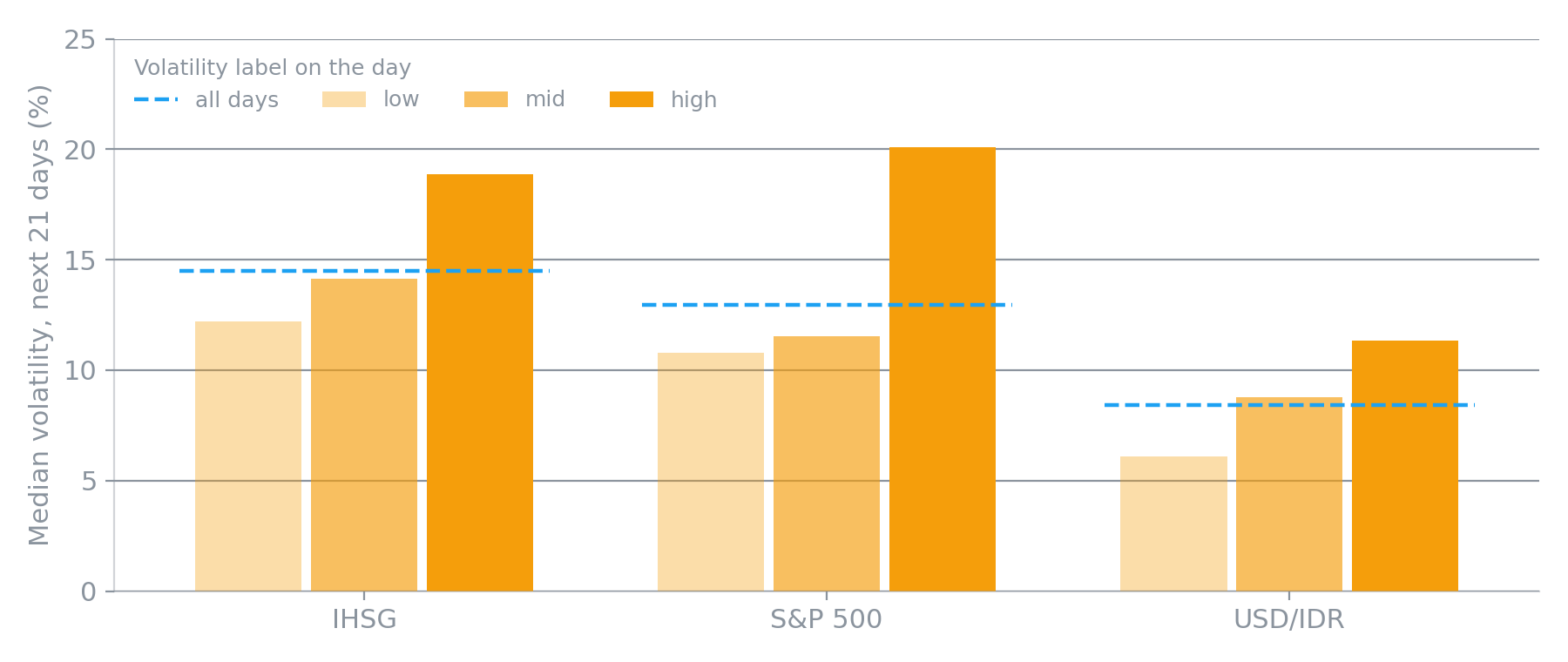
Median volatility over the next 21 trading days, grouped by the volatility label on the day. Dashed line: all days.
This isn’t news. Benoit Mandelbrot noticed in the 1960s that large price changes tend to be followed by large changes of either sign, and Robert Engle’s ARCH model, which earned him a share of the 2003 Nobel, was built on the same observation. The dashboard only confirms that it holds in IHSG and USD/IDR too. If you read one label on the page, read this one. It tells you something about next month, just not which way it will go.
IV.
Back to the trend rule. If its promise is about bad months, the fair test looks at bad months: the 10th percentile of next-month returns, meaning the return that one window in ten fell below. If the rule works as advertised, the 10th percentile after downtrend days should be clearly worse than after days in general.
The awkward part is when I thought of this. I added the column only after the median came back empty, which is exactly how people end up fooling themselves. Andrew Gelman and Eric Loken call it the garden of forking paths: every choice made after seeing the data, even an innocent one, lets the result pick the analysis. If the tail test had failed as well, I could have tried the 5th percentile, then the worst month, then drawdowns, until something worked.
So I did the boring thing. Before computing the new column on real data, I wrote the hypothesis and the decision rule into the code and committed them, with a test that fails if anyone edits them later. The rule: in the baseline settings, the 95% interval for the gap between the downtrend row and the all-days row has to sit entirely below zero, with IHSG as the main test and the S&P 500 as the replication. The commit with the rule is timestamped about a minute before the first build that contained the numbers. A minute is thin as pre-registrations go, but the order is on the record.
I also did one thing I’d have skipped if I were in a hurry, and I’m glad I didn’t. Before looking, I ran the same test on synthetic prices with bear markets planted on purpose: six months to a year of steady decline at three times the normal volatility, between calm bull runs. The test said “supported” in 1 of 12 runs. On pure noise it raised no false alarm in 12. So I knew, before seeing IHSG, that the test could barely detect an effect even when I had put one there, and I wrote that into the pre-registration too. An excuse written after the result is worth nothing; one written before is just a caveat.
The result:
| Market | Downtrend | All days | Gap [95% interval] | Verdict | Same direction |
|---|---|---|---|---|---|
| IHSG | −8.2% | −5.5% | −2.7% [−8.8%, 2.4%] | not supported | 9 of 11 |
| S&P 500 | −9.1% | −4.6% | −4.5% [−6.5%, 3.1%] | not supported | 11 of 11 |
Not supported in either market, as the power check predicted. The direction is what trend followers would expect: bad months after downtrends are worse, in 9 of the 11 variations of the settings for IHSG and all 11 for the S&P 500. The intervals still run well past zero in both.
V.
A “not supported” from a weak test is a boring ending, so I pulled the thread. There are only twelve IHSG downtrends since 2005 and ten in the S&P 500, few enough to look at one by one.
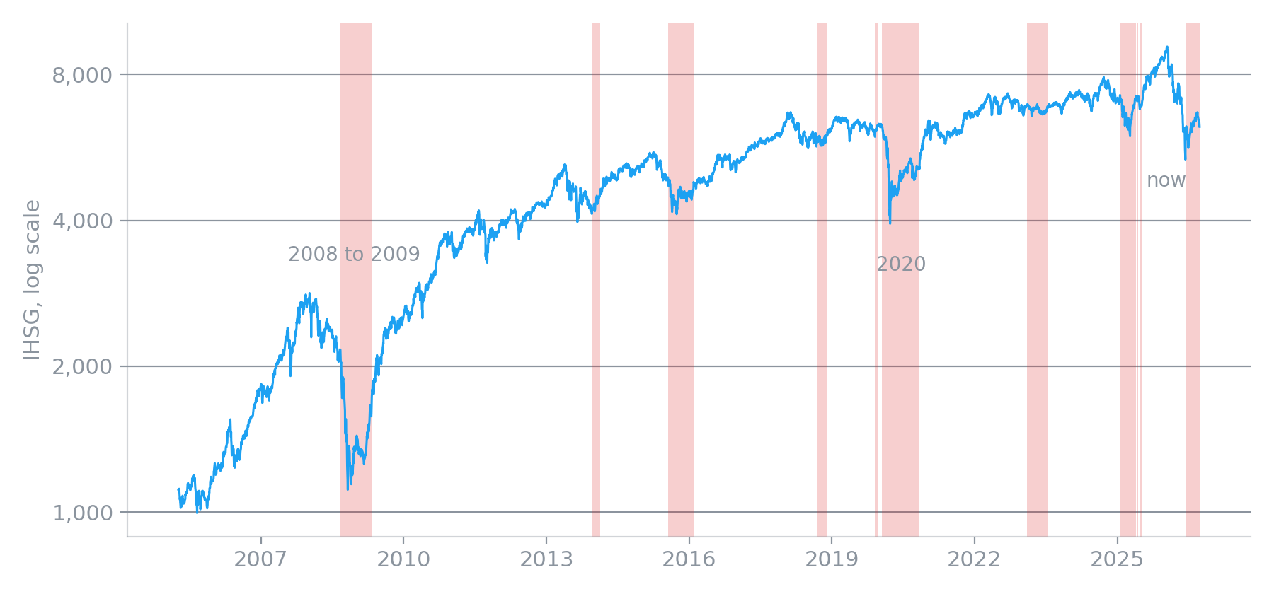
IHSG since 2005, log scale. Shaded: the twelve spells the rule labeled a downtrend.
The simplest check is to drop each episode in turn and recompute the downtrend 10th percentile without it.
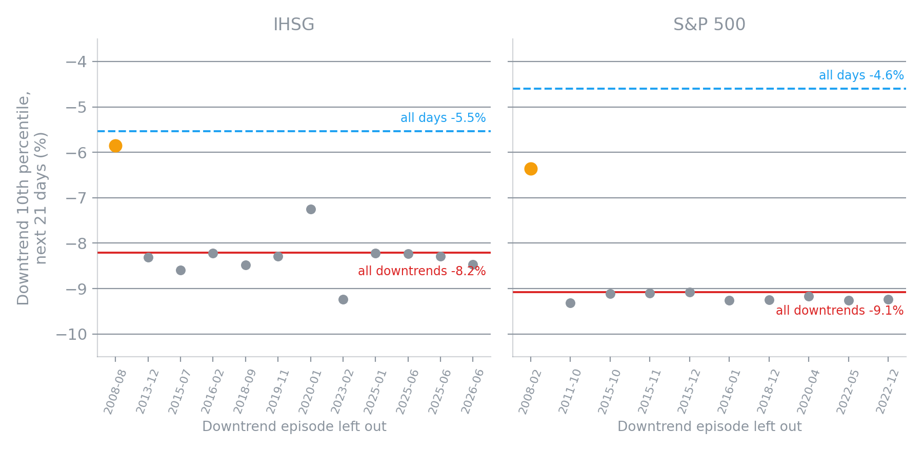
Each dot is the downtrend row’s 10th percentile with one episode left out. Orange: the episode that started in 2008.
Eleven of the twelve IHSG dots sit where you’d expect, around −8%. Drop any of them and nothing much changes. Drop the one that started in August 2008 and the downtrend tail goes from −8.2% to −5.8%, right next to the −5.5% of all days. The S&P 500 looks similar, with one difference: without its 2008 episode the gap shrinks from 4.5 points to 1.8 but doesn’t disappear.
So in IHSG, the trend rule’s case for protecting you in bad months is one crisis deep, and in the S&P 500 it’s mostly one crisis deep.
It’s worth looking at what that crisis did to the rule. IHSG peaked on 9 January 2008 at 2,830. The rule turned down on 25 August, when the index was already 25% lower, and IHSG then fell another 48% by late October. The S&P 500’s rule turned down in February 2008, 15% off the high, with 49% still to go before the March 2009 bottom. Late, but early enough to matter, because 2008 was a slow crash, measured in months rather than weeks.
The fast crash went differently. In 2020 the S&P 500 lost about a third of its value in five weeks, and the rule never called it. The label only turned down on 28 April, a month after the bottom, when the index had already rebounded 28%. IHSG’s label had been down since 22 January 2020, before most people had heard of the virus, because the index had been sagging since mid-2019. Call that luck: the lag happened to line up with the crash. A 200-day average can only react to a fall that lasts long enough to move it.
VI.
There are two ways to read this, and I think both are right.
The skeptic says a result that disappears when you remove one observation is an anecdote, and you can’t build a rule on an anecdote.
The trend follower says that’s the point. Insurance pays once a decade, and a policy that did little in eleven ordinary downtrends and paid out in the one that mattered did its job. Scoring it by how often it helped is like judging a seatbelt by the share of drives in which it did anything.
That both are right is the real finding. The trend rule’s claim is about rare events, and twenty years of one market contain about one of them. Taleb’s complaint about fat-tailed domains is that the rare events which decide the outcome are also the ones your sample is least likely to contain, and this is a small, clean example of it. The question “does the rule protect you in crises?” needs a sample of crises, and IHSG since 2005 has given me one. The pre-registration kept me from pretending otherwise. It couldn’t add a second crisis.
What would? A longer history would, if it’s clean. IHSG existed long before 2000, and a daily series from the 1990s would include 1997 and 1998, exactly the kind of episode this test needs. I haven’t checked whether Yahoo’s older data is usable. Other markets would help less than you’d hope, since 2008 was one global event rather than twenty independent ones. And time would help, slowly, at a price nobody wants to pay.
VII.
One more pattern, which I’m reporting as a hypothesis because I noticed it after the fact.
In two of the eleven IHSG variations, the direction flipped. With a slower rule (100, 300 and 90 days instead of 50, 200 and 60), the month after a downtrend had a median return of 3.1%, ended up 73% of the time, and had a better 10th percentile than average, all clearly different from the all-days row. Over a 63-day horizon instead of 21, downtrends were followed by a median gain of 6.2%, against 3.2% for all days.
If that’s real, it means that by the time a slow trend rule calls IHSG a downtrend, the worst has often passed, which is close to the opposite of what trend following assumes. You can see it in the episode list: the rebounds after the 2013 taper tantrum, in mid-2025, and this June. You can also tell stories for why an Indonesian index might behave this way, from foreign money that leaves in waves and stops when the wave ends, to falls that are mostly imported shocks and fade when the shock does. I haven’t tested either story.
The case against taking it seriously is strong. It wasn’t pre-registered, the variations reuse the same dozen episodes, and with about a hundred cells in IHSG’s trend tables you’d expect around five asterisks by luck alone. There are six. What makes me hesitate is that they aren’t scattered: five of the six sit on the downtrend row, all pointing the same way, under the slower settings. That’s worth writing down now, with a decision rule, and testing on data that doesn’t exist yet.
VIII.
So what does the label tell you today?
IHSG has been in a downtrend for 76 trading days. Translated honestly, the index is well below where it traded over the past 200 days, and that average is still falling because it remembers January. In IHSG’s history, that tells you almost nothing about whether the next month will be good or bad. The volatility label is in its middle band, which does say something, and what it says is dull: the next month will probably be about as bumpy as usual.
On 8 June the rule was one day away from calling a downtrend, and it called it on the day the market bounced 7.6%. That’s what a 200-day average is: a memory, useful when the thing it remembers is about to happen again. For IHSG, twenty years have given it one thing worth remembering, and I’d rather say that plainly than dress up a sample of one as a law.
The tables, the pre-registration, the power check and every figure here come from code in the site’s repository. The full sensitivity report can be rerun from its Actions tab.